
Typing in St. Thomas University’s’ website was a different experience for students returning to school this September.
A recent change of the website has some students reeling.
“I went on last night just to find WebAdvisor again because I usually have it saved on my computer, but it wasn’t, and I couldn’t find Webadvisor anywhere that I looked.” said Kayla Cummings.
Cummings is a fourth year at St. Thomas University, majoring in Psychology. She isn’t very happy with the recent changes, she’s confused why students weren’t informed of the update.
“They should have gotten input from students who use it the most on how to change it, or what should be changed, or what should stay the same, in my opinion,” said Cummings.
Mitchell Syvrait-Caplin, a fourth year student, found out about the changes roughly after the launch of the new site.
“I was indifferent really at the time, because whenever I was looking for something I found it very easy to find. The collapsible menus they did have were decent, so you could find something very well,” said Syvrait-Caplin.
When Syvrait-Caplin began to look for WebAdvisor and Moodle, he did eventually find them located at the bottom of the page. He said it was easy to bookmark those links, but the previous quick links were much easier to format.
“The reason they’re not in the header is because I want that geography for potential students,” said Jeffrey Carleton.
Carleton, the director of communications for STU, worked with two outside agencies and staff at the university to get both the front end design, and the back end content for the website. The previous website, which was launched in 2009, was due to be refreshed.
“It’s always the small stuff that people miss or they get used to and we knew that the footers would be one of them,” Carleton said. “We simply did not want to give away premium geography at the header for potential students to visit us.”
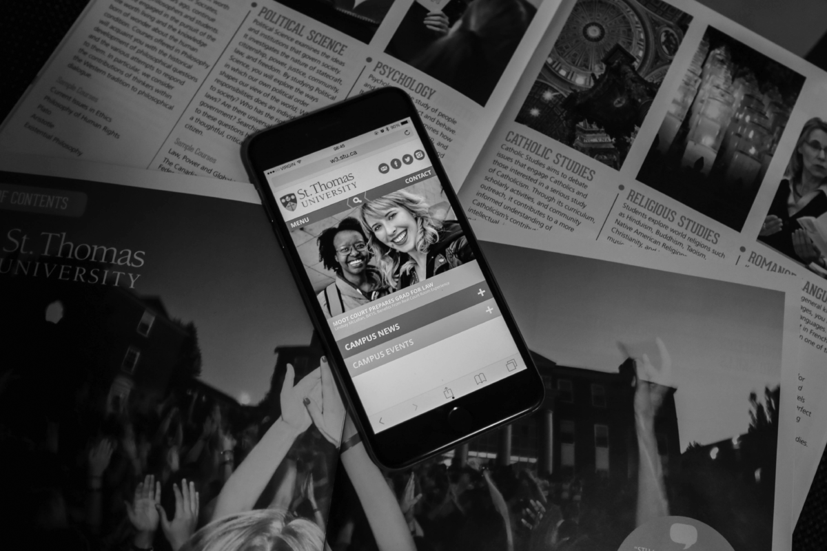
Carleton said one of the main priorities of the new website design was to be responsive and detect which device the user was on, such as a smartphone, a tablet, or a desktop, and automatically render content to fit. The other priority was to make sure the content attracted potential students.
“We know the design is fresh and modern, it’s responsive, we know students are increasingly using smartphones for communications, and especially as the smartphones get bigger. So I just made the decision that it would be a nice surprise for them and the feedback we’ve received has been exceptionally positive,” said Carleton.
Syvrait-Caplin said he does like the new design, and has gotten used to some of the changes.
“Overall I find the site is nice, it has a very modern look to it, it’s not just the simple dull green and yellow, like it actually looks like it’s more lively, but I would like to see some kind of quick link for students.”