The following piece is satire. The words and quotes do not represent the views of The Aquinian. None of the quotes or sources are real.
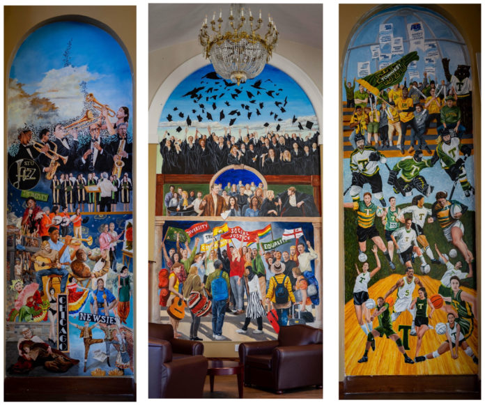
The walls of St. Thomas University have a new mural in George Martin Hall painted by none other than Bill Johnson, husband of STU president and vice-chancellor Dawn Russell, as part of a “beautification project” for the school.
When the STU Alumni Association couldn’t hire Banksy to create the masterwork, they settled on Russell’s husband.
“We thought, ‘meh, what’s the worst that could happen?'” said Dan Deadwood of the STU Alumni Association.
The three-section mural stands on the back panels of the Great Hall. It is meant to represent the diverse community life of STU students.
Russell’s husband distorted the students’ faces to call back to the immense artistic depth of Edvard Munch’s The Scream. This represents the painful existence of a university student, swimming in debt, screaming internally and drowning in loneliness despite being surrounded by others. The painted students’ crooked, sinister smiles emphasize how they hide their pain to look successful and please their teachers.
Elizabeth Phillip, a fourth-year political science student, thinks it accurately portrays the complex social community of students.
“It’s progressive. Representation is beautiful,” she said with a tight grin and her hands trembling under her textbooks.
She looked over her shoulders, quivering.
When we began the interview, about twenty students sat in the Great Hall, their backs to the painting. When I began to ask Phillip about the mural, the other students left in a hurry.
“I think a lot of us are scared to say anything,” she said.
She looked again over her shoulder, towards the registrar’s office. No one was around.
“Actually,” she whispered. “Maybe keeping it in the family doesn’t scream diversity.”
A student entered the room, and Phillip refused to answer any more questions.
Billiam Spakeshere, a second-year English student, doesn’t want to say anything bad about the mural that could undermine its wholesome message.
“It’s just so beautiful. I don’t want to look too deep under the surface and ruin that,” he said.
Spakeshere thinks that the words in the middle of the painting are good ideas: “truth, community, mild equality, mild social justice, mild diversity.” However, when you consider those and the substance of the painting, the message doesn’t hold up.
“Well, sure it says ‘diversity,’ but up in the mural’s grad class, there isn’t a lot of diversity. It looks pretty white bread, if you know what I mean,” he said.
Spakeshere wonders, if the mural wants to showcase diversity, how the artist could have missed that.
“This looks like someone who isn’t a part of the community tried to make a diverse mural to represent students, but it falls short,” he said. “Where are the trans and disabled people? Did anyone even talk to a student before they painted this?”
Spakeshere wants to value the mural for what it tried to be, but he may have a hard time.
“Now that I think about it, the painting is just ugly as fuck.”

